With less than a month to go until the first round of the 2019 F1 Season, every single one of the 2019 teams have revealed their car liveries. Some of the teams have chosen to spice things up in a radical fashion, including F1's mainstays and with testing underway and every team looking to outdo the other in the preseason, we need to definitively rank how they each did in the style department.
Some of the teams swung big and landed, while others missed or played it rather safe, making for an interesting mix of liveries in the rankings this year. The livery department is one where everyone has a level playing field to get to the top of the table. Whether you're a backmarker or a title challenger you always have the opportunity to create a stunning car.
Whether a teams prowess on track will coincide with their livery quality is to be seen. Some top teams could falter, and some slower cars could still look great while chugging along. Obviously, these rankings are only one person's opinion so feel free to leave your opinions in the comments. Time to rank some liveries!
#10 Williams
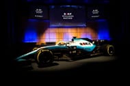
Having ditched title sponsor Martini for the 2019 season, Williams had a great opportunity to rethink their White and Blue design completely this year. However, with a world of opportunity on their table, Williams instead chose the same color scheme with an altered fade style and an out of place looking "ROKiT" branded across the car.
Releasing this livery in a poorly lit setting and not rocking it up to testing makes it even harder to find any positive aspects of the paint job. Every other team may have stayed stagnant or taken a small step forward, but as far as I'm concerned, Williams is the only livery of this year to have taken a step back.
#9 Racing Point

The team formerly known as Force India have taken a very strange marketing strategy to kick off the 2019 Formula One season. Despite the original claim that the Racing Point name was just a placeholder, the team has seemingly stuck with this for the long-run, whatever that may be. And instead of distancing themselves from the old Force India by changing up their livery and giving themselves a distinct identity, they've simply slapped some stickers and a bit of blue on the Pink Panther livery of 2018 and branded themselves "SportPesa Racing Point."
The novelty of the pink car that we saw in 2017 is long gone and with all the confusion regarding the name and identity of this brand, Racing Point has narrowly avoided having the worst livery just be virtue of Williams' monumental missed opportunity. All that being said, I still have to put Racing Point near the bottom of the list because of the seeming lack of effort and innovation to make a better livery.
#8 Toro Rosso
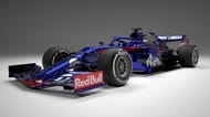
If you couldn't tell that this car was any different than last year's then I don't blame you. Toro Rosso have chosen to play it as safe as possible and keep essentially the exact same livery as the last few years. Given that both Red Bull and Toro Rosso are now under the Honda banner, I thought we would see change of some sort to mark this transition, however neither team have done so.
While their Red Blue and Silver color scheme is not displeasing by any means, it' gotten a little boring at this point. Toro Rosso especially do not get off the hook for this as I don't think they've endeared themselves to fans in the same way as the iconic matte finish of Red Bull. They also didn't pull out any sort of testing livery to give fans a look into what they could have been either. Overall, I would love for Toro Rosso to give their paint job an update in the near future.
#7 Haas
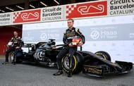
I had to include Grosjean in this picture with the 2019 Haas car because it just brings up some memories of the Frenchman racing for another Black and Gold team. Apparently, Haas didn't get the message from Lotus to "change it a little so it doesn't look like you copied." The Black and Gold 'Rich Energy' powered Haas doesn't look bad by any means and with the 'HAAS' emblazoned on the side in Silver as opposed to Gold, it does give the car a unique edge.
However, overall this car just brings to mind memories of Lotus and to be perfectly honest, Lotus did it better in every way. I wish this team would embrace their place as the sole American entry in F1 right now and add few stars and stripes for emphasis, but for now, I guess we are settling for Lotus 2.0.
#6 Renault
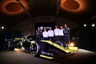
The most unique thing about this Renault car for 2019 is that Daniel Ricciardo will be driving it. The French outfit's iconic Black and Yellow is back, and while it is as aesthetically pleasing as it always has been there is nothing new about it, which keeps it in the bottom five of the 2019 liveries for me. The Renault car in recent seasons has had the quality of looking very black from the side but a shining yellow from head-on, and this effect is as present as ever.
Overall, this is an example of a design that has been done right but has not evolved a lot. I don't think the Renault Black and Yellow has gotten to the point of being stale yet, even if it has been around longer than the Pink Panther and Toro Rosso liveries. What can I say, other than its French flair is still fantastic to look at.
#5 Alfa Romeo
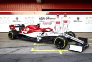
At this point we have gotten into the cars that I don't think have any massive flaws on them. The Alfa Romeo livery looks sweet and classy with that combo of the Corsa Rossa and the ice white across the front of the car. The veteran Kimi looks like he fits in white as well and with the Sauber branding gone, I appreciate that Alfa have embraced the Italian side of themselves completely.
It's not a massive change from last year but it's fresh enough to keep me interested and the altered Alfa logo on the back half of the car fits seamlessly into the royal aesthetic that the team seems to be going for. The former Sauber has been making a fair amount of steady progress heading into this year and with Ferrari's last world champion at the wheel, maybe we will see a few more points positions for this bright red and white livery.
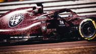
Extra points to Alfa Romeo as well for the surprise valentine's day livery that they splashed on us.
#4 Red Bull
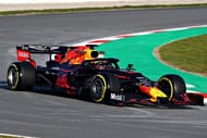
The 2019 Red Bull car looks rather indistinguishable from most of Red Bull's cars since they started applying a matte finish, however it still remains a modern classic. The bold blue highlighted with additions of Red and Yellow looks as good as ever, although it is a little disappointing that they did not incorporate their new Honda partners in a more visible manner.
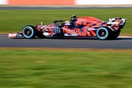
What was not disappointing however was the camo livery that we saw before the release of the RB15, was enough to blow all our minds. The prevailing sentiment on F1 social media as soon as this livery was released was a collective prayer for this to be the full season livery. It was not to be the case, but either way points to Red Bull for going out of their way to give us a look at a creative and truly special livery before they unveiled their always classic Red, Blue & Yellow outfit.
#3 Mercedes
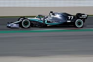
After a few years of a very standard silver livery, Mercedes have chosen to change things up a little and did so with some cheek and a whole lot of success. After teasing some possible crazy combinations of blue and black on the car (which ultimately ended up being the wheel rim pattern,) Mercedes introduced a sleek silver and black update to their 2019 title challenger.
They have also added a checkering of Mercedes stars on the bodywork of the 2019 car which fades into view on the darker parts of the chassis. A lot of graphic designers release hypothetical liveries for many F1 teams, and I think for once Mercedes may have outdone all of them, with a completely unique flash on their 2019 title challenger.
The modern design of this all-new car just makes it even more apparent that Mercedes are on the eight-ball and are not keen to stay behind the wheel in any aspect of the sport. This car looks like it could be a championship contender any day of the week and that's a testament to how sleek the livery is.
#2 McLaren
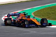
Winning my vote for favorite livery of last year, McLaren unleashed another strong Papaya car to add to their list of orange challengers for 2019.I think their embrace of the Blue as part of their identity has really helped the livery evolve from last year, and with an all-new driver lineup, the car and drivers look as good as ever.
The papaya rings of McLaren's historic success as always and that midnight blue just enhances the car to no end. Hopefully, we won't have to see this car too far back on the grid and this era of McLaren and papaya sees a great increase in fruitfulness because this livery certainly deserves to be up there.
With the departure of legend Fernando Alonso and the firing of Stoffel Vandoorne, it will be up to newcomer Lando Norris and the young Spanish star of F1 to make the best of a McLaren that could seemingly be making their way back to the top. In their blue race suits and the papaya MCL34, we just may see that.
#1 Ferrari
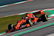
This has to be Ferrari's biggest push towards the title yet. After coming close in the past two seasons, the Scuderia really doesn't have much choice but to take the challenge to Mercedes this year. This stunning Red and Black livery has gotten the Tifosi excited again with the matte finish being so critical in making this car as good looking as it is.
Ferrari's don't usually come in matte, but I think that this car may just change that in great vain in the future. The improved placement of the sponsor logos has been a welcome change as well, especially the previously hideous 'Mission Winnow' Logo, which now actually suits the car in a black tint. It seems fitting that Ferrari has slowly replaced the white accents on its car with black and as now taken away its glossy finish to shave of some grams to improve performance as much as possible.
This beautiful new scarlet challenger just screams with the passion of the Scuderia to finally topple Mercedes.
F1 2019 News, Updates, Calendar, Standings and more on Sportskeeda
