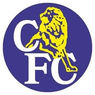
#4 Ken Bates minimal design (1986-2005)

When Ken Bates bought Chelsea in 1982 for a sum of £1, he decided to change the crest that has served the club well for 33 years and replace it with a simpler one that would be easy to keep up with the merchandising business in football. Le Coq Sportif, a French sportswear company, designed a minimalist crest with a lion standing over the letters 'CFC'.
This design made it easy for merchandising and with Chelsea establishing itself in the English top flight over the next one decade, the crest became known across the world too. Many variations of this crest were used depending on the colour of the jersey.
Though it saw the resurgence of Chelsea on a global scale, it was very unpopular among the fans as it closely resembles the Millwall logo. After being used for 19 years this crest paved way for the most recent one as the centenary approached.
