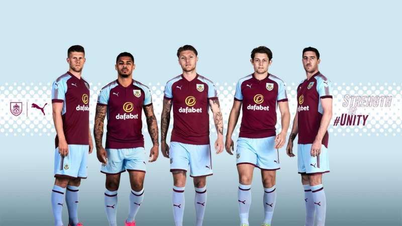
Burnley have retained their traditional claret and blue colours. While most Premier League sides seem to have decided to leave the shoulders a bit plain in general, Burnley felt the need to be creative in that space. It looks like they sprinkled tiny spots from a near-empty spray can all over the shoulders down to the arms. While their primary colour combination is just as pleasing as it has always been, the new changes are like stones weighing them down on this list.
Ad
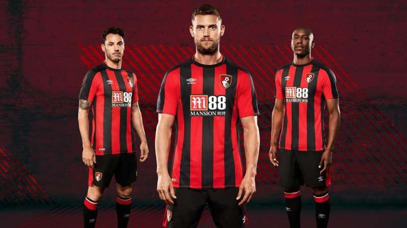
#11 Bournemouth
Bournemouth have always been a bit too disinterested in change
Even though Umbro have taken over Burnley's kit designing department, they have simply made the stripes narrower and extended the stripes on to the sleeve. There is very little change and the sponsor name and logo at the heart of the t-shirt look as hideous as ever.
×
Feedback
Why did you not like this content?
Was this article helpful?
Thank You for feedback
About the author
Shambhu Ajith
Shambhu is a European and international football journalist at Sportskeeda who focuses on previews, listicles and news articles. An ardent Manchester United supporter since before his teenage years, he started following the Red Devils by age 10 watching MUTV on television. Shambhu is also a highly-revered rapper and a playback singer on Spotify, having a whopping 1 million monthly listeners.
For his articles, Shambhu believes in triple-checking every piece of information, relying on trusted websites like Transfermarkt and Opta, and staying away from speculative publications. He believes that his law degree helped him to be more articulate and meticulous with his content and one of his core strengths is seamlessly involving emotion in his write-ups owing to the love for the sport. For Sportskeeda, has done exclusive interviews with Spanish legends Gaizka Mendieta and Fernando Morientes so far, and his articles boast of a huge readership of close to 50 million.
Shambhu's favorite footballer is Lionel Messi, and the Argentine attaining glory in 2022 is his favorite FIFA World Cup moment. He believes only Kylian Mbappe and Erling Haaland could replicate Messi and Cristiano Ronaldo's rivalry in the years to come. His favorite manager is Sir Alex Ferguson due to the Scot's unmatched longevity at the top.