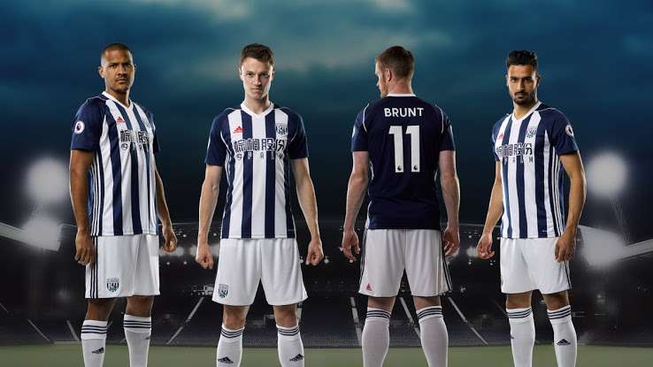
West Bromwich Albion players in their 2017/18 kits
Ad
Trending
West Brom’s traditional colours of navy blue and white are quite a captivating combination. The back of the kit is in navy blue as opposed to the white from last year. Even though the sponsor logo looks bloated, they’ve at least kept it in sync with the theme of the kit. But the red colour Adidas logo looks a bit odd and could’ve been aligned better with a small portion of it barging into the adjacent blue stripe.
Ad
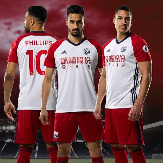
WBA’s away kit for the 2017/18 campaign
Ad
White is the base colour of WBA’s away kit. The sleeves and the shoulders are red and the collar is navy blue in colour. The navy blue collar and stripes on the side look ill-fitted on what is an otherwise decent looking kit.
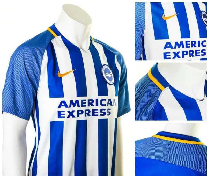
#7 Brighton & Hove Albion
Brighton & Hove Albion’s fresh kit
Ad
In touch with the Brighton tradition, blue dominates the kit with white as the secondary colour.
The yellow trim and the stripes are quite pleasing. The classic stripes look good but they could’ve toned down the brightness just a tiny bit. Okay, maybe a bit much. The long sponsor name has been nattily dealt with which is an aberration from the usual course taken by clubs these days.
×
Feedback
Why did you not like this content?
Was this article helpful?
Thank You for feedback
About the author
Shambhu Ajith
Shambhu is a European and international football journalist at Sportskeeda who focuses on previews, listicles and news articles. An ardent Manchester United supporter since before his teenage years, he started following the Red Devils by age 10 watching MUTV on television. Shambhu is also a highly-revered rapper and a playback singer on Spotify, having a whopping 1 million monthly listeners.
For his articles, Shambhu believes in triple-checking every piece of information, relying on trusted websites like Transfermarkt and Opta, and staying away from speculative publications. He believes that his law degree helped him to be more articulate and meticulous with his content and one of his core strengths is seamlessly involving emotion in his write-ups owing to the love for the sport. For Sportskeeda, has done exclusive interviews with Spanish legends Gaizka Mendieta and Fernando Morientes so far, and his articles boast of a huge readership of close to 50 million.
Shambhu's favorite footballer is Lionel Messi, and the Argentine attaining glory in 2022 is his favorite FIFA World Cup moment. He believes only Kylian Mbappe and Erling Haaland could replicate Messi and Cristiano Ronaldo's rivalry in the years to come. His favorite manager is Sir Alex Ferguson due to the Scot's unmatched longevity at the top.