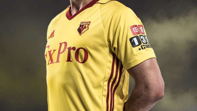
The Adidas kit with the stripes and the Crimson addition around the neck give the kit a classy feel. The sponsor logo (name) is red now and it’s a welcome change. But the name still looks stretched out.
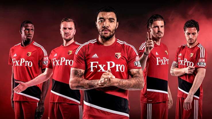
Watford’s away kit is pleasing on the eye
Ad
Watford’s away kit is primarily red, complete with a black-white diagonal strip around the waist and the iconic Adidas stripes. It is reminiscent of Bayern’s kits in the recent past. The black-white diagonal stripe could have been done away with. Sometimes plain might be the way to go, eh?
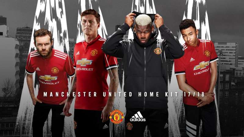
#5 Manchester United
United’s traditional red, white and black combined with the iconic Adidas stripes
Ad
The classic Adidas stripes are back on the shoulder and the red colour is uniformly stretched across the entire jersey, unlike last year. The black bits on the sleeve are worthwhile additions. The collar looks overdone and is a bit of a disappointment and so is the stretched out Chevrolet logo. But all in all, United’s home kit looks classy.
Ander Herrera, Paul Pogba and Jesse Lingard sporting United’s away kit for the 2017/18 campaign
The Manchester United away kit is inspired by the cult classic blue jersey of 1990-92. It is black in colour with three stripes on each side on the body.
×
Feedback
Why did you not like this content?
Was this article helpful?
Thank You for feedback
About the author
Shambhu Ajith
Shambhu is a European and international football journalist at Sportskeeda who focuses on previews, listicles and news articles. An ardent Manchester United supporter since before his teenage years, he started following the Red Devils by age 10 watching MUTV on television. Shambhu is also a highly-revered rapper and a playback singer on Spotify, having a whopping 1 million monthly listeners.
For his articles, Shambhu believes in triple-checking every piece of information, relying on trusted websites like Transfermarkt and Opta, and staying away from speculative publications. He believes that his law degree helped him to be more articulate and meticulous with his content and one of his core strengths is seamlessly involving emotion in his write-ups owing to the love for the sport. For Sportskeeda, has done exclusive interviews with Spanish legends Gaizka Mendieta and Fernando Morientes so far, and his articles boast of a huge readership of close to 50 million.
Shambhu's favorite footballer is Lionel Messi, and the Argentine attaining glory in 2022 is his favorite FIFA World Cup moment. He believes only Kylian Mbappe and Erling Haaland could replicate Messi and Cristiano Ronaldo's rivalry in the years to come. His favorite manager is Sir Alex Ferguson due to the Scot's unmatched longevity at the top.