
'%20x='0'%20y='0'%20height='100%25'%20width='100%25'%20%0A%20%20%20%20%20%20%20%20%20%20xlink%3Ahref='data:image/jpg;base64,/9j/2wBDAAYEBQYFBAYGBQYHBwYIChAKCgkJChQODwwQFxQYGBcUFhYaHSUfGhsjHBYWICwgIyYnKSopGR8tMC0oMCUoKSj/2wBDAQcHBwoIChMKChMoGhYaKCgoKCgoKCgoKCgoKCgoKCgoKCgoKCgoKCgoKCgoKCgoKCgoKCgoKCgoKCgoKCgoKCj/wgARCAAFAAoDASIAAhEBAxEB/8QAFQABAQAAAAAAAAAAAAAAAAAABAX/2gAIAQEAAAAApF//xAAUAQEAAAAAAAAAAAAAAAAAAAAD/9oACAECEAAAAF//xAAUAQEAAAAAAAAAAAAAAAAAAAAB/9oACAEDEAAAAD//xAAgEAACAgEDBQAAAAAAAAAAAAACAwEEEgAFEQYUIXLh/9oACAEBAAE/AOoxXQ3exfwyJpvlmBSBFEWI8c/NUVWHUq7e9sjmsSxhzOI5j21//8QAGxEBAAAHAAAAAAAAAAAAAAAAAgABAwQSQaH/2gAIAQIBAT8As6rYyU9riUf/xAAYEQACAwAAAAAAAAAAAAAAAAAAAQIDEf/aAAgBAwEBPwCyKTw//9k='%3E%3C/image%3E%3C/svg%3E)
Football kits have always been an integral part of brand management in football. These are not just mere shirts with patterns designed to be worn while playing a football match. They are colors worn with pride around the globe expressing the sentimental involvement an individual possesses with a club.
Football is a business after all. Since club jerseys help to form an even stronger connection with fans and in turn bring strong profits for clubs, they are designed with utmost care. Each jersey has a story to tell, and sometimes it turns back pages to memorable chapters in history.
However, at the end of the day, it functions as a fashion statement to those roaming around the streets proudly reflecting on the clubs they support. Surely, as a globally popular football club, you do not want to commit the mistake of designing a jersey that your fans would think twice before buying let alone wear.
Here are five of the worst jerseys this season, ones that you would probably reject as a Christmas or Birthday present too:
#5 Atletico Madrid Third Kit
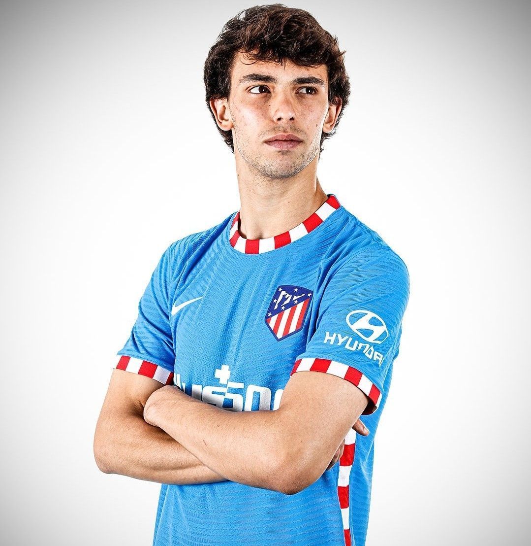
Atletico Madrid tried to keep up with modern times by trying to be different from their usual classic and simple linear designs with the home kit. There were red blots in white, along with those memorable straight vertical lines that looked like scattered ink. Overall it was a design that was different and it was likable. Wish we could say the same thing about their third jersey.
For their third kit, Atletico chose Blue, a color with few haters and then for some reason put those classic Atleti Red and Whites around the collars and other boundaries like embroidery. The shade of blue chosen is light and goes easy on the eye, but it is definitely paired in the wrong manner with those attention seeking red and whites.
It is eye-catching, no doubt. But it is weirdly attracting the eye towards the collar and the sleeves. The jersey pays tribute to Los Rojiblancos' former home, Vicente Calderón. Atletico's new home stadium is the Wanda Metropolitano.
The Nike kit is made of 100 per cent polyster fabric, which is made from recycled plastic bottles. Even though there is a certain Christmas vibe going on with this one, reminiscent of a candy cane, it still makes for a bad gift. Joao Felix cannot even look us in the eye after posing for this one!
#4 Liverpool Third Kit
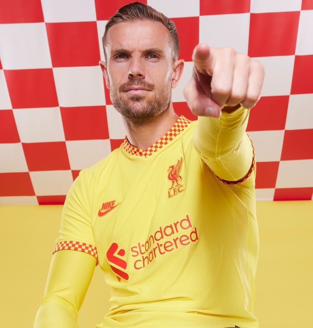
This is bright, just too damn bright! There is something about yellow jerseys that makes them almost instantly unlikeable. It is a challenge to produce 'a thing of beauty' when you choose yellow as your primary color and it is no shock to see Liverpool fail at their efforts.
Every other character on the jersey appears in red, which only adds more unwanted shine to the shirt. The checkerboard design in red on the collar and on sleeve ends has been inspired by the checkered flags that were popular on Liverpool's European nights since 1977. However, they seem like a formality that had to be done, because everyone puts something for a change on those sides.
This Nike jersey pays tribute to the iconic Kop stand at Anfield, which is one of the most loudest places to watch a game in the Premier League. The yellow kits were frequently adopted by Liverpool in 1980s.
The shirts, like most Nike ones this year, have been constructed with recycled bottles. Liverpool have tried to back their strong and sentimental history with this new jersey, but you cannot blame us for craving McDonald's after staring at that kit for too long.
#3 West Ham Away Kit
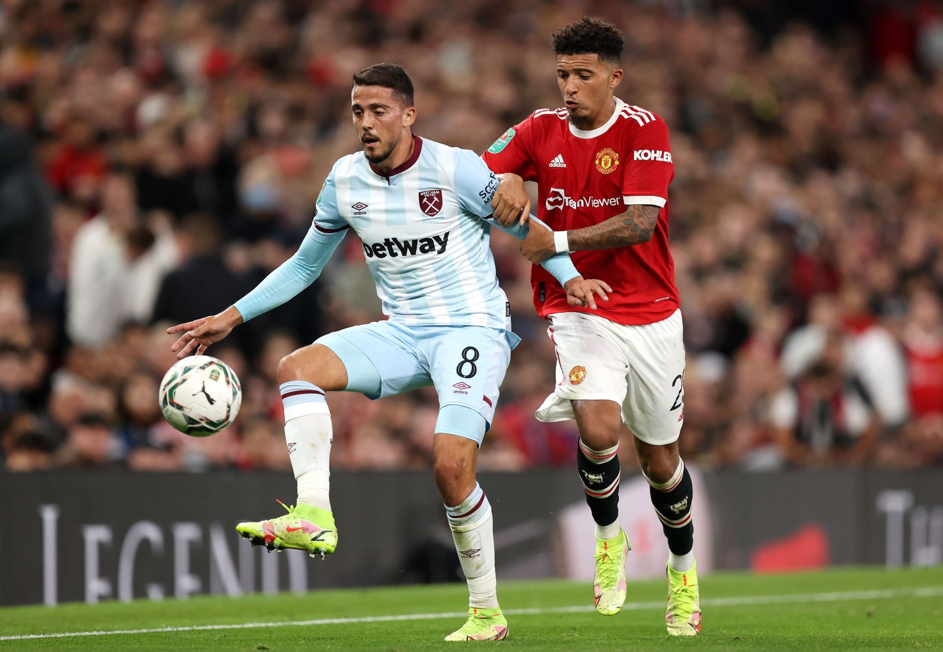
It is difficult to guess exactly what the plan was with this one, but "attracting eyeballs" was evidently not on the list. This is clearly not the best way to celebrate West Ham United's comeback to the Europa league. Though they finished in the top six last season, this jersey is clearly fighting a relegation battle of its own.
Perhaps this is one jersey where applying those secondary brown-colored stripes on the sleeve ends would have helped, but West Ham chose to place those thin lines just above. The kit has been manufactured by Umbro, who have not produced the most impressive jobs and ruined further by the sponsors Betway. The Sky Blue stripes are quite light in shade and it's a contrast that doesn't quite appeal with the white.
West Ham's famed claret has been fixed at the split collar and above the sleeve cuffs. The sky blue shorts and white socks are definitely complementing the shirt for the worse. When you really focus on getting the striped pattern wrong, you can really get it wrong.
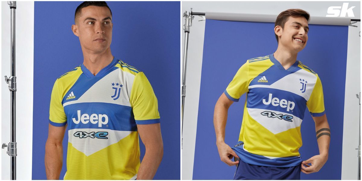
#Juventus Third Kit
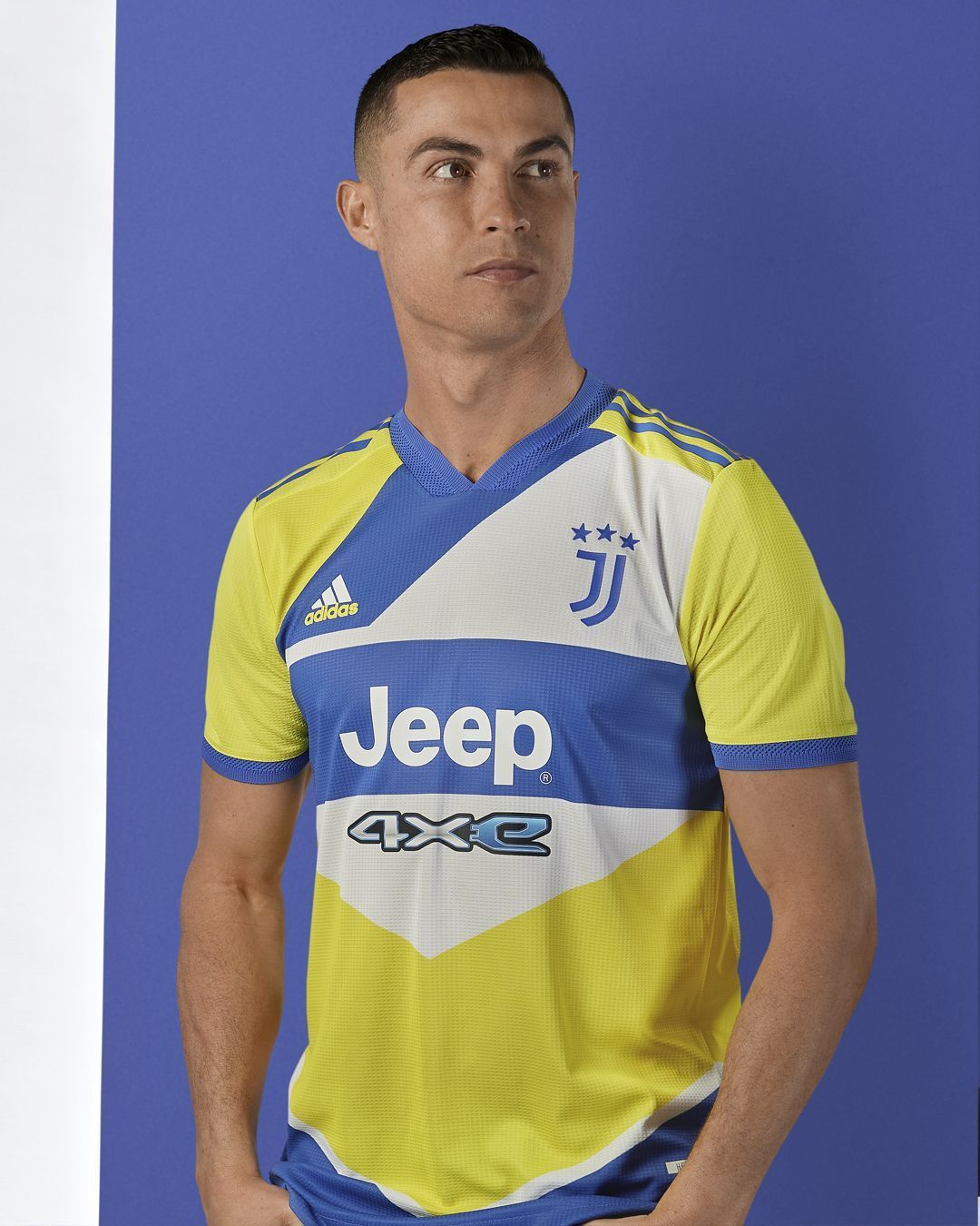
As his parting present, Cristiano Ronaldo gave Juventus a photoshoot in their third jersey. A loose piece of artwork that is best left on its own in the shopping stores. Clearly in the picture itself, Ronaldo has an expression as if to say, "This better get over soon". You can't blame the superstar for feeling that way.
The jersey looks a blend of two, as if they have been intelligently masked over one another, but it's just a very awkward color combination to start with. Adidas even mixed colors in their logo, making it half yellow and half white. The jersey presents Adidas' ventilated V-neck collar design. Juventus received a horrendous response on social media for their third kit.
The kit aims to celebrate Juventus' golden reign of 1990s. But honestly it's just a disastrous giant patchwork with giant color blocks. Fair to say Adidas just pulled a Nike out of the hat this time. Perhaps, Juventus' third kit contributed just as much as Sir Alex Ferguson in Ronaldo's return to Manchester United.
#1 Tottenham Hotspur Third Kit
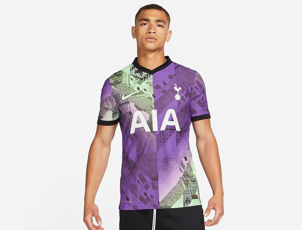
When the disappointment of falling from the Champions League to the Europa League and then to the Conference League hits you hard, you come up with such a jersey. At first glance, it feels like someone spilled purple ink by mistake over a newspaper. Even though Nike tried to make it look edgy, they only ended up making it untidy.
Designers at Nike probably have a misconception about what eye-catchy is. Daniel Levy must have gone to Harry Kane's contract negotiations wearing this jersey when the new season began. No wonder the England captain wants out
In an appreciable gesture, Tottenham allowed young artists who had been attending workshops at Tottenham Textiles to pair up with Nike's designers and come up with this jersey. The kit aims to express the vibrant vibe of the Spurs neighborhood. The jerseys are made from 100 per cent recycled polyester fiber.
But it is safe to say this looks like an accident, a forgetable one too.