
8. Manchester United
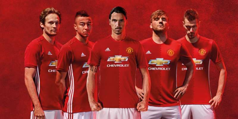
There’s not much going on with Manchester United’s home kit this season but that being said, it does look quite smart on the Red Devils who featured in the promotion. With Adidas’s signature stripes running down the side of the shirt, the two tone red shirt is quite attractive and a departure from what we’ve seen on the United players in more recent years.

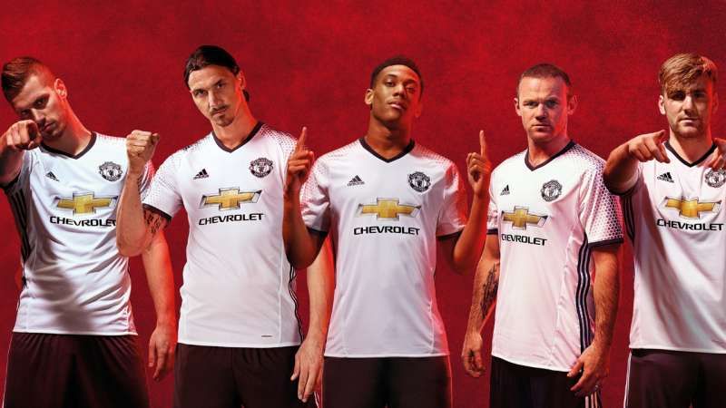
The away kit on the other hand is far removed from anything United fans are accustomed to. Adidas seem to be experimenting with mélange for football players as seen in the United away strips. United have reverted to the colour blue this time with the club crest in red.
They revealed their third kit most recently – a white shirt with black trimming and shorts -meant as a tribute to their humble beginnings as a team of railway workers.
7. Everton
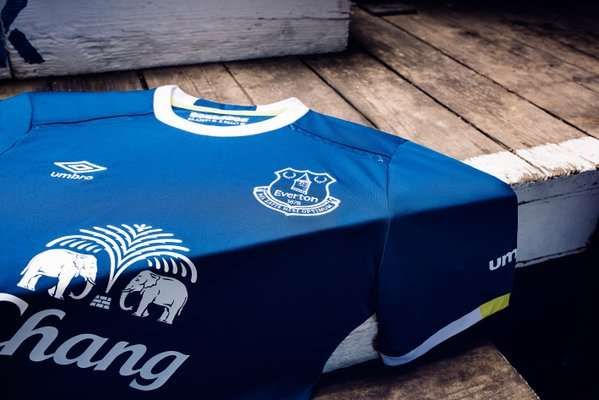
Umbro deserve all the credit for coming up with a great home kit for the Toffees while staying true to their traditional colours at the same time. The clean cut and round-necked shirt looks better for the white trim on the neck and sleeves. The bit of yellow on the shirt and shorts trimming is a quirky addition that fans have to love.
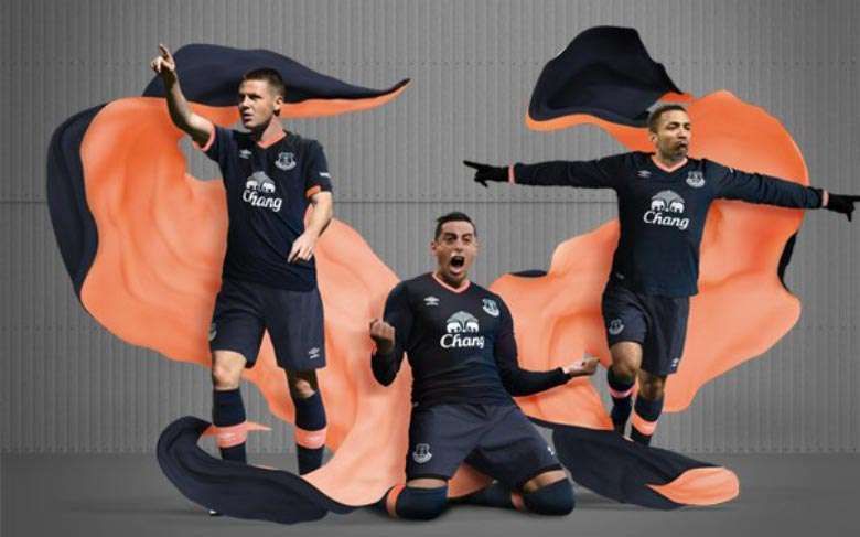
The away kit might be simple – an all navy blue strip with salmon trim – but Umbro had a very good reason for the design. The kit is meant as a tribute to the 1980-81 season when they won the league title for the first time.
