'%20x='0'%20y='0'%20height='100%25'%20width='100%25'%20%0A%20%20%20%20%20%20%20%20%20%20xlink%3Ahref='data:image/jpg;base64,/9j/4AAQSkZJRgABAQAAAQABAAD/2wCEAAMDAwMDAwQEBAQFBQUFBQcHBgYHBwsICQgJCAsRCwwLCwwLEQ8SDw4PEg8bFRMTFRsfGhkaHyYiIiYwLTA+PlQBAwMDAwMDBAQEBAUFBQUFBwcGBgcHCwgJCAkICxELDAsLDAsRDxIPDg8SDxsVExMVGx8aGRofJiIiJjAtMD4+VP/AABEIAAUACgMBIgACEQEDEQH/xABfAAEBAQAAAAAAAAAAAAAAAAAAAwgQAAIBBQADAQAAAAAAAAAAAAECAwAEBQYSBxETIQEBAAAAAAAAAAAAAAAAAAAABREAAgICAwAAAAAAAAAAAAAAAQIAAxFBBAUh/9oADAMBAAIRAxEAPwCeq+M9Bs9dFjHhInTN2ha9ec/aU/SJSojkf20fBPS8kftaKxmpaXa42zgi1DWuIreJE6x4duVUAe2ZiSaUpXjMwaz3Yj3YVVKKgqKuF0MT/9k='%3E%3C/image%3E%3C/svg%3E)
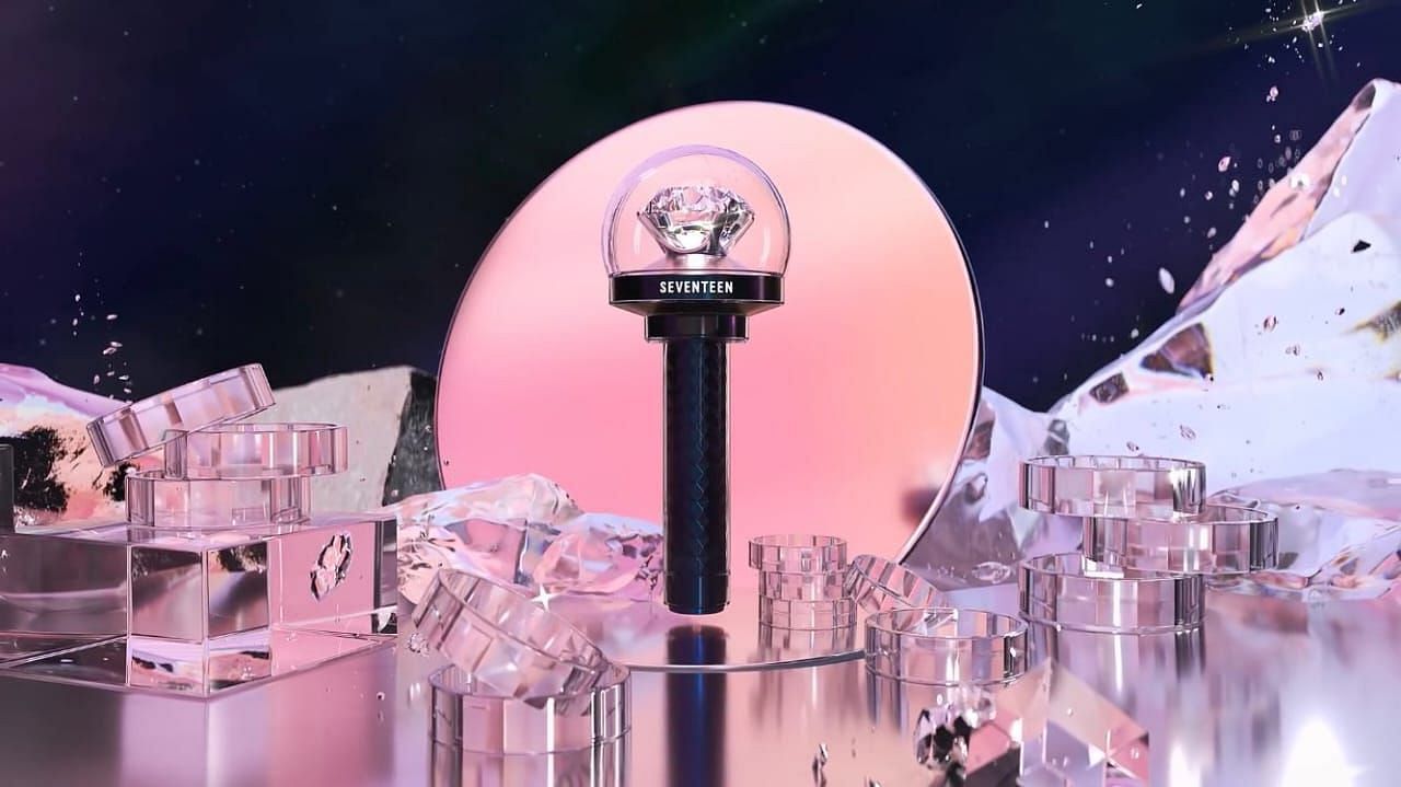
After the teaser release of SEVENTEEN's latest lightstick, CARATBONG Ver 3, the design was finally revealed on February 18, 2023, and fans aren't happy about it. SEVENTEEN is known for having one of the prettiest lightsticks, especially the second version of CARATBONG. Fans felt that the design of the third version was not only a step back, but also alienated them from the group's core personal idiom.
Many aspects of the second version, such as the diamond-shaped dome on top of the lightstick and the use of SEVENTEEN's official colors, rose quartz and serenity, throughout, as well as the glittery body, best represented the group and their aesthetic. With CARATBONG Ver 3 lacking all these features, fans believe it no longer screams SEVENTEEN.
Fans felt that everything about it, from its black color to its lean shape, is unlike a CARATBONG, and the diamond inside the dome is the only indication that it is the 13-member group's lightstick. They continued to express how the upgrade wasn't necessary and liked the second version far better.
While some are reluctant to accept the design of the new version, others feel that it could be an allusion to a new concept that the group is experimenting with.
Fans react to SEVENTEEN's new lightstick design, CARATBONG Ver 3
While fans were ecstatic when Pledis Entertainment released a teaser for CARATBONG Ver 3 given their track record of promising lightstick designs, the reveal disappointed many. Although the first and second versions contained many SEVENTEEN-related elements, the third version did not feel like it belonged to the group.
The second version of CARATBONG also stood out majorly from the huge crowd of K-pop lightsticks with its grandness, color scheme, and extravagance. It was difficult to find lightsticks that resembled a CARATBONG, and fans adored it. However, CARATBONG Ver 3, has presented itself as just another lightstick with its simplicity, dull color scheme, and toned-down look.
Additionally, the uniqueness of SEVENTEEN's lightsticks stems from their unconventional approach to their creation. Unlike the typical lightsticks put forth by K-pop boy groups, CARATBONGs were not simplistic. The new version's departure from what fans were proud of has irked them.
While many fans have expressed their criticism of CARATBONG Ver 3, some have tried to see the bright side of the same. Some fans are also happy with the design and trying to understand the reasons behind the drastic change in the group's latest lightstick design. The change in aesthetics could refer to a shift in concept or representation of their growth from the previous design, and fans strive to support it to the best of their abilities.
However, given that members rarely contribute personally to the creation or construction of these lightsticks, the situation perplexes fans as well. It's also difficult to ignore the fact that many new lightstick editions have become more minimalist and simple as many agencies try to modify their previous designs into a more compact design.
While many fans are trying to cultivate an optimistic perspective on the new CARATBONG Ver 3's design, some also wish to get their hands on the second version instead.