'%20x='0'%20y='0'%20height='100%25'%20width='100%25'%20%0A%20%20%20%20%20%20%20%20%20%20xlink%3Ahref='data:image/jpg;base64,/9j/2wBDAAYEBQYFBAYGBQYHBwYIChAKCgkJChQODwwQFxQYGBcUFhYaHSUfGhsjHBYWICwgIyYnKSopGR8tMC0oMCUoKSj/2wBDAQcHBwoIChMKChMoGhYaKCgoKCgoKCgoKCgoKCgoKCgoKCgoKCgoKCgoKCgoKCgoKCgoKCgoKCgoKCgoKCgoKCj/wgARCAAGAAoDASIAAhEBAxEB/8QAFQABAQAAAAAAAAAAAAAAAAAABAj/2gAIAQEAAAAAqBP/xAAUAQEAAAAAAAAAAAAAAAAAAAAA/9oACAECEAAAAH//xAAUAQEAAAAAAAAAAAAAAAAAAAAA/9oACAEDEAAAAH//xAAdEAABBAIDAAAAAAAAAAAAAAABAgMEERAhFTFC/9oACAEBAAE/AJkaTyUYtqbLR8qUobG7od4//8QAFBEBAAAAAAAAAAAAAAAAAAAAAP/aAAgBAgEBPwB//8QAFBEBAAAAAAAAAAAAAAAAAAAAAP/aAAgBAwEBPwB//9k='%3E%3C/image%3E%3C/svg%3E)
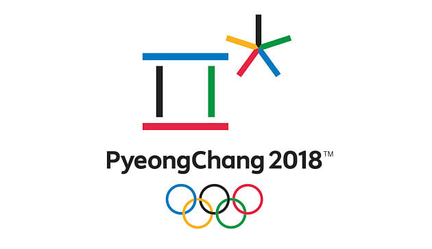
Last month, the PyeongChang Olympic Organizing Committee revealed its logo for the 2018 Winter Olympics; and I must say, I’m scratching my head over this one:
The logo is reminiscent of that great game I used to play at my grandmother’s house called Pick Up Sticks. I’d pull out the tall can, dump the multi-colored sticks on the ground, and then my brother and I would play, trying to pick up sticks without disturbing the others around them. Perhaps the artist(s) was also a fan of this game?
As with any logo or medal design, the organizing committees always defend their designs by providing some sort of symbolism to explain the meaning behind them. PyeongChang’s organizing committee said thatthe design is inspired by the Korean alphabet, also known as Hangul. According to the committee, the design uses the Hangul characters for the consonants P and C in PyeongChang. But there’s much more! The committee also said that, “The first character in the emblem also represents a gathering place where the three elements of Cheon-ji-in – heaven, earth, and human – are in harmony. The second character symbolizes snow and ice, as well as the athletes’ stellar performances. PyeongChang 2018’s new emblem symbolizes a grand gathering of people from all around the world in celebration of Olympic winter sports….”
I can see the inspiration from the Hangul alphabet, but representing heaven, earth, and human? For me, it looks more like PyeongChang is putting an asterisk by its name: PyeongChang *
Is there something we don’t know about these future Olympic Games? Is this logo foreshadowing future Olympic results, à la 9.79*, an infamous result from the last Olympics held in South Korea? Hmm….
Faster, Higher, Stronger.