
'%20x='0'%20y='0'%20height='100%25'%20width='100%25'%20%0A%20%20%20%20%20%20%20%20%20%20xlink%3Ahref='data:image/jpg;base64,/9j/2wBDAAYEBQYFBAYGBQYHBwYIChAKCgkJChQODwwQFxQYGBcUFhYaHSUfGhsjHBYWICwgIyYnKSopGR8tMC0oMCUoKSj/2wBDAQcHBwoIChMKChMoGhYaKCgoKCgoKCgoKCgoKCgoKCgoKCgoKCgoKCgoKCgoKCgoKCgoKCgoKCgoKCgoKCgoKCj/wgARCAAGAAoDASIAAhEBAxEB/8QAFQABAQAAAAAAAAAAAAAAAAAABgf/2gAIAQEAAAAAhJf/xAAUAQEAAAAAAAAAAAAAAAAAAAAC/9oACAECEAAAAB//xAAUAQEAAAAAAAAAAAAAAAAAAAAD/9oACAEDEAAAAF//xAAiEAACAQMDBQEAAAAAAAAAAAACAwQBBhEABRMSITEyQWL/2gAIAQEAAT8A225LZjbZRD7VU11AWJlV9S5Sp7F1eQz+dTJEV0t7I8KiEGZECuUi4xz2HP3Gv//EABYRAQEBAAAAAAAAAAAAAAAAAAECAP/aAAgBAgEBPwCZDf/EABYRAQEBAAAAAAAAAAAAAAAAAAECAP/aAAgBAwEBPwC7UN//2Q=='%3E%3C/image%3E%3C/svg%3E)
#2 Replacing the red strap with a black one
Ad
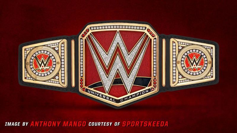
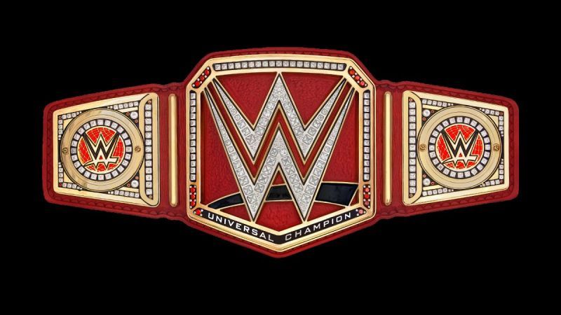
Since my biggest complaint is that there's too much red all over the place, the biggest offender of this is the red strap.
Ad
This redesign is my actual favourite and something that I think requires minimal effort, keeps things classy, and also gives it a distinct red pop behind the W to differentiate it just enough.
Sting in WWE once again? More details HERE
The Raw Women's Championship makes the mistake of having the red version of the WWE logo on top of a red background, so if you're going to keep the red behind the W, the black swoosh is definitely a must.
For my money, this is what they should have gone with from the start, and you'll see that every future design on this list has a black strap as well.
Feedback


Edited by anirudh.b
