
'%20x='0'%20y='0'%20height='100%25'%20width='100%25'%20%0A%20%20%20%20%20%20%20%20%20%20xlink%3Ahref='data:image/jpg;base64,/9j/2wBDAAYEBQYFBAYGBQYHBwYIChAKCgkJChQODwwQFxQYGBcUFhYaHSUfGhsjHBYWICwgIyYnKSopGR8tMC0oMCUoKSj/2wBDAQcHBwoIChMKChMoGhYaKCgoKCgoKCgoKCgoKCgoKCgoKCgoKCgoKCgoKCgoKCgoKCgoKCgoKCgoKCgoKCgoKCj/wgARCAAFAAoDASIAAhEBAxEB/8QAFgABAQEAAAAAAAAAAAAAAAAAAAYI/8QAFAEBAAAAAAAAAAAAAAAAAAAAAP/aAAwDAQACEAMQAAAAz9LB/8QAHxAAAgAFBQAAAAAAAAAAAAAAAQQCAwUGERAxMkFS/9oACAEBAAE/AKHcilPt1tKZREmWIuLEwA7+gQc46wYdP//EABQRAQAAAAAAAAAAAAAAAAAAAAD/2gAIAQIBAT8Af//EABQRAQAAAAAAAAAAAAAAAAAAAAD/2gAIAQMBAT8Af//Z'%3E%3C/image%3E%3C/svg%3E)
On Thursday, the Los Angeles Kings announced that they have redesigned their logo. The new logo is a modern take on the iconic design from 1988 to 1998 and includes an updated version of the original "Kings Crown" from their first season.
The Los Angeles Kings hockey franchise has undergone numerous logo redesigns since entering the NHL in 1967.
Los Angeles Kings logo history
Entrepreneur Jack Kent Cooke was awarded an NHL expansion franchise for LA in 1966. He chose the regal "Kings" moniker and purple and gold colors inspired by royalty.
The Los Angeles Kings' original 1967 logo featured a large golden crown with purple plumes and jewels. The words "Los Angeles" and "Kings" were written in a flowing script, evoking royal proclamations.
In 1976, the logo was updated with short horizontal streaks added to the word "Kings," lending it a more dynamic appearance. The lettering was enlarged extending beyond the shield, while the crown was reduced.
The colors and streaks closely resembled those of the Los Angeles Lakers, given that both teams shared the same owner.
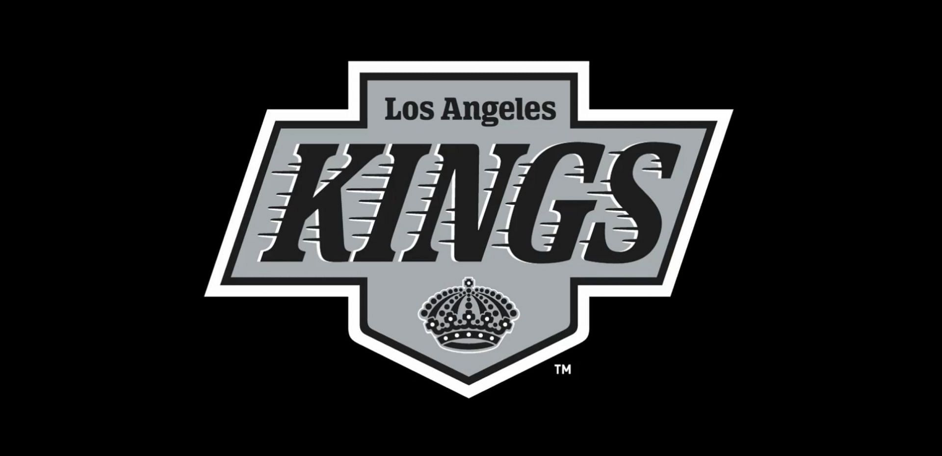
The 1988 logo retained the "moving" word "Kings" and other elements but introduced a black and silver palette, with purple and gold reserved for the small crown.
This emblem was short-lived and was replaced the following year by an updated version featuring silver and black throughout, with white added for contrast. A parallelogram frame was superimposed over the hanging banner, confining the word "Kings" within the logo's main body.
Major changes occurred in 1998. The logo now featured a classic shield adorned with three royal emblems – a lion, a crown and the sun – along with crossed hockey sticks. The word "Kings" was in black on a grey tab. The color scheme was expanded to include a noble shade of blue or purple.
In 2002, the crown became the sole focus of the logo, appearing as a refined version of the 1999 design. The modern, discreet crown featured dark blue, black and grey details, with crossed hockey sticks as its most notable decoration. This marked the first time the team's name was absent from the logo.
The 2011 logo incorporated elements from past designs, such as the shield shape, the distinctive "LA" lettering and the crown. However, it was distinctly different from its predecessors.
In 2019, small changes were made to the logo compared to the previous ones, with only three colors: silver, black and white.

Wayne Gretzky’s wife Janet responds to critics questioning his loyalty to Canada, Bobby Orr's support following 4 Nations drama