The Atlanta Falcons were established in 1965 as an expansion team. Their on-field debut came in 1966 when the team joined the National Football League (NFL) in the AFL - NFL merger era. The Falcons have gone on to represent NFC two times in the Super Bowl, but have nothing to show for it as they lost both times. They are also one of the 12 teams without a Lombardi trophy.
The Evolution of the Atlanta Falcons Logo
The team name was selected after several fans participated in the contest to help the franchise get its name. The ‘Falcons’ name came out victorious and the name's entry was done by Julia Elliot, a school teacher. She described the bird as proud and dignified with great courage to fight. The Falcons logo has been only redrawn once in the franchise’s entire existence. Mark Verlander is the artist of all three emblems used in the team's history.

1966 - 1989 - Old Logo
The Falcon is featured in a monochrome geometric shape and facing right. The falcon's face and claw are in such a way that the whole emblem looks like an ‘F’ which represents the team name. The bird’s face and claws are separated from its wings. The wings are flattened and facing ninety degrees downward. The whole logo is black with wings having white stripes. The logo has two outlines in white and red.
1990 - 2002 - Second Logo
The second logo has red completely removed from its color palette. Everything else remains unchanged except the outer lines are now white and black. The logo looks more modernized.
2003 - Present - Current Logo
The logo was completely redrawn with black, red, white and silver palettes. The look and aesthetics of the emblem remain the same as the previous version but the head is now not separated from wings. The beak is formed as sharp edges are used and claws are defined clearly. The white eyes of the falcon are also seen in this emblem
Atlanta Falcons Alternative Symbols
The team has come up with only two alternate logos as of July 2024. The first one came in 1998 which had ‘A’ in bright red over the Falcons logo. Another one which came in 2020 has an ‘ATL’ wordmark where A has wings. ATL is a short form of Atlanta.
Atlanta Falcons Anniversary Emblems
The team has been around for quite a long time so it comes as no surprise that Atlanta has come out with three anniversary emblems till 2024.
1990
The first-anniversary emblem was made to celebrate the team's silver jubilee. It is oblong with ‘25’ written in silver in the middle over a red background. The Falcons' original logo is over ‘25’. The number is surrounded by a thin white outline and a thick black line which has the team name written on it. The whole logo is surrounded by a thin maroon outline.
1995
The 30th-anniversary emblem has a red color shield type logo with a black ribbon passing through the middle where the team name is pasted. The logo has a black Falcons emblem at the top with ‘30’ situated at the bottom in white. There is also a thin black ribbon passing through a number with an anniversary wordmark written on it in uppercase.
2015
The 2015 emblem represents the golden jubilee of the team. Here ‘50’ is written in very large fonts with white in it. The number is surrounded by a red outline. Below ‘50’, the seasons wordmark is present in uppercase. Atlanta’s old and new logos are present on the left and right of ‘50’ respectively.
Atlanta Falcons Helmet Design
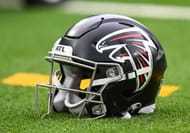
Atlanta has mostly worn three different primary helmets as of July 2204. They started with red as the primary color and slowly moved to black, which has been a staple on headgear for the last three-plus decades.
1966 - 1989

For the first few years in the league Falcons wore a bright red color helmet but at the start of the 70s, the red was toned down a little bit. The bird logo was attached on both sides with white/black/white lines running down the middle of the headgear. In the franchise's early years, there were also two gold stripes adjacent to white lines running down the center.
1990 - 2002
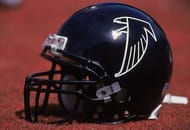
The Falcons decided to change the color palette of the helmet at the start of the 90s. The red color was completely removed and black became the main attraction. The new logo was also seen on the helmet. However, there were no stripes running down the center of the helmet this time.
2003 - 2019
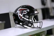
Only the logo on the headgear was changed in this version. Everything else remained untouched.
2020 - Present

During the rebrand in 2020, Atlanta made the logo on the helmet 30% larger than the previous helmet version. That was the only major change in the headgear department.
Alternate Helmets
Falcons have only used one alternate helmet in their history which is a very rare occurrence for a team who has been in the league since mid 60s.
2022 - Present
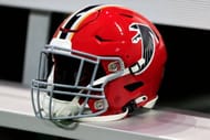
After the NFL's two-helmet ban was lifted, the Falcons decided to bring back their original red version of headgear. This helmet is a replica of the original one.
Atlanta Falcons Uniform History

Atlanta has used different uniform sets in the team's history but the red, black and white color palette has been always incorporated into them.
1966 - 1970

1971 - 1989

The era of bright red jerseys began in the 70s. The home jersey with red had white numbering on it outlined by black. White/black/white stripes were present on the sleeves. The away version was vice versa with red numbers outlined by black and sleeves immersed in red/black/red stripes. Until 1978, white pants were worn by Falcons players but since the start of the 1978 season, silver pants have come into the picture. Both versions of pants had red and black lines on the side.
1990 - 2002

They reintroduced the original uniform set with black as the primary color in the home version. The away jersey was also reminiscent of the '60s. However, since 1997 the numbers on away jerseys changed to red from black. The only difference came in pants compared to the original. Both jerseys were complimented by silver pants this time around.
2003 - 2019

The dark shade of red was introduced and became a permanent fixture for almost the next two decades. The home red version had white numbers on it with a black outline. The sleeves had a thick white and black combination on the lower part. In the away version, the red numbers had a black shadow while their sleeves had a red and black combination on the lower part. Both uniform sets had black undersides on jerseys.
2020 - Present

The Falcons went on to have a big rebranding in 2020. The black jersey has big white numbers with red shadows. There are also red lines running down on both sides of the jersey. ‘ATL’ is written in uppercase above the number block which is the short form of Atlanta. Both the sleeves have a primary logo on them. The white version is vice versa of black ones with black numbering and red lines on the side.
The most unique uniform that the Falcons brought in 2020 is their gradient uniform. The color palette is red and black. The uniform looks like the black is rising from the bottom towards the top as the pants are black. The lower part of the jersey is black while the uppermost part is red with both colors intersecting in the middle.
Alternate Uniforms

Both the alternate versions have a black base with white numbering trimmed in red.
FAQ's On Atlanta Falcons Logo History
A. The Atlanta Falcons are owned by Arthur Blank.
A. The Falcons logo is considered a personification of courage, strength and kindness.
A. The Atlanta Falcons are also known as Dirty Birds.

