The Green Bay Packers are one of the oldest and most storied franchises in the NFL and are known for their unique ownership structure. They are the only non-profit, community-owned sports team across all major leagues in America. The team which was established in 1919 has 4 Super Bowls and the league-best 13 championships under their belt.
Also known as ‘TitleTown’ due to its rich history and winning culture, the Packers boast one of the most loyal fan bases in North America. Let’s take a peek at how the team got its logo and uniforms.
The Evolution of the “Green Bay Packers” Logo
“1921-1936” - Original Logo
The fan-owned team had used 4 different logos before settling on iconic G. The first logo had AP with Acme Packers wordmark below it along with Green Bay font at the bottom. All this was surrounded by two rectangular outlines. Acme was a meatpacking company and the sponsor for the Green Bay Packers during the time. However, as time went on only the Acme Packers wordmark was used in bold lettering with a thick green outline.
“1937-1950” - City Name Introduced and Notre Dame Ties
The team was renamed Green Bay Packers in 1937 and so a need for a new emblem arrived. This logo also came into existence due to the team's original founder Curly Lambeau’s history with Notre Dame. This logo had a ‘GB’ monogram which stands for the town name the team plays in. Its design was the same as the Notre Dame logo i.e. horizontally stretched G and vertical B overlapping each other. The logo’s color was dark blue with a gray outline surrounding it.
“1951-1955” - Change of Color
After Lambeau left the team in 1949, there was a significant change with the new head coach’s arrival. This was the first time that dark green color was used primarily in Green Bay’s logo. The Packers wordmark was the main focus here with all letters in the capital with P being extra large. The orange football is behind the inscription along with 4 thin red cross marks on both ends of the ball.
“1956-1960” - Green and Yellow Combination
With a new coach came a new emblem with a vertically placed football. In it was a player wearing a yellow jersey with the number ‘41’ on it along with a green Wisconsin state map behind him. The player also had a yellow football in his hand. The jersey with the number 41 was used in the emblem as previously both Hall of Famers Arnie Herbert and Clarke Hinkle wore that number jersey when playing with the Packers.
This logo was altered slightly when Vince Lombardi took over the reins in 1959. In this one, everything remained the same as before except a football player running with the ball was used instead of jersey one. There were no numbers used on player jerseys around this time.
“1961-1979” - Iconic ‘G’ Introduced
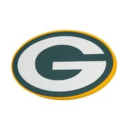
The most famous English G came into the picture in 1961. It was something completely different from previous iterations of the Packers logo. The capitalized elongated white G was placed in a horizontal dark green oval-shaped appearance. This was also the first logo to appear on players helmet.
“1980 - Present” - Today’s Logo
The previous logo only underwent one slight facelift in 1980. The yellow outline was added to the horizontal oval shape.
“Green Bay Packers” Alternative Symbols
The Packers have only used previous primary logos as alternate logos in their history. The two alternate logos that have been present since 1980 until present are the same as the current primary logo with the Packers wordmark under it. One alternate logo has G on a yellow background with a green Packers wordmark under it. Another alt logo has G on a dark green background with a yellow Packers wordmark under it.
“Green Bay Packers” Anniversary Emblems
Green Bay Packers are more than a century-old football team, so definitely there would have been different anniversary occasions for the team to celebrate. The team unveiled the first-anniversary logo on completing 75 years in 1993. The emblem was triangular in shape and was pointing downwards. A yellow ribbon was on the triangular shape with uppercase lettering on it. The 75 was enlarged in the center with a diamond-like shape outline.
Another anniversary logo was created in 2018 when the team completed 100 years of its existence. The logo featured the Packers’ primary emblem in the middle separating ‘100’ and ‘seasons’ in a shield-like structure. The 100 is written in white with a green background while ‘seasons’ is written in green with a white background diagonally.
“Green Bay Packers” Helmet Design

Until 1951, Packers used to wear a brown leather helmet. However, since then they have only worn a metallic gold helmet until present. There was no logo in the 1950s on the helmet. The oval G was first used in the 1961 season on the headgear. It also has dark green and white elements which run through the center of the helmet. The elongated G is pasted on both sides of the helmet.
2010 - 2012
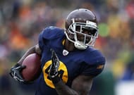
The Packers debuted a brown helmet along with 1929-inspired uniforms. There were no logos or numbers on this helmet. These helmets were scrapped in 2013 after the league's new rule of using only one helmet.
2021 - Present
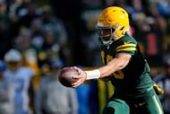
Since the start of 2021, Green Bay has started using a 1950s-era helmet as the alternate version. These helmets are without any decals and represent the franchise's first introduction of gold helmets back in 1950.
“Green Bay Packers” Uniform History
The iconic green and gold jersey which has become synonymous with football has not seen any major changes since 1959. However, that was not the same case before it, as the Packers had seen more than 10 variations in their design and color. Let’s dive into a memory lane of what Green Bay’s uniforms looked like before settling on green and gold.

1919 - 1920
The Packers started out their football journey by wearing dark navy blue jerseys and brown pants.
1921
In 1921, the navy blue jersey had the ACME PACKERS wordmark written on it with the same brown pants.
1922 - 1924
They wore a golden jersey for the first time with nine navy blue lines on the sleeves.
1925 - 1926
Only navy blue stripes were added on the shoulder and thin lines were removed from the sleeves. Light gold pants were worn.
1927 - 1928
Blue was the primary color on the jersey with 13 blue and gold vertical stripes from chest to stomach on both chest and sleeves. The pants were blue.
1929 - 1930
Green Bay opted for navy blue jerseys with gold circles where numbers were written. The pants were of tan color.
1931 - 1934
The Packers went with a darker shade of navy blue jerseys with white numbers on the back along with gold pants.
1935 - 1936
Green uniforms were introduced for the first time in franchise history. Dark green jerseys with gold sleeves and shoulders. The pants were green.
1937 - 1949
Navy jerseys were worn once again with gold shoulder yoke and golden pants.
1950 - 1953
Green and gold palette was introduced and there were three jersey rotations used. One was dark green with gold numbers and two gold stripes on the sleeves. The second one was vice versa. The third one was a full white jersey with dark green numbers and stripes on the sleeves.
1954 - 1957
Navy blue jersey returns once again with mustard gold numbering and stripes on the sleeves. Faded gold pants were worn to complete the set.
1959 - Present
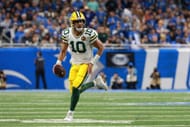
With the entrance of Vince Lombardi, there was a major overhaul in the uniforms of Green Bay and the same color pattern is still used even today. The dark green jerseys with white numbering and yellow and white stripes on both sides of the sleeves were introduced to wear at home. The away jerseys were white in color with dark green numbers to go along with yellow and green stripes on both sleeves. Both jersey sets are completed by gold pants.
There have been some minor modifications in the jerseys over the past 7 decades but the aestheticism of the uniform has remained the same.
Green Bay Packers Throwback Jerseys

The Packers brought back these throwback beauties in 2010 which were inspired by their 1929 uniforms and wore them for multiple years.
Green Bay Packers Alternate Uniforms
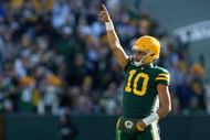
These alternate units Packers debuted in 2021 have a green-on-green combination. The shade of green is different from their home jerseys while the helmets have no decals. This jersey has taken a page out of a 1950s book.
FAQ's On Green Bay Packers Logo History
The elongated G on the Packers logo represent Green Bay, the city in which they play.
A. The Georgia logo is different in color and has slightly different dimensions than the Packers’ English G. However, Georgia still had to get permission from Green Bay to incorporate it in their logo and get permission from the Packers.
A. The Green Bay Packers fans are called cheeseheads.
