The Seattle Seahawks were one of the two expansion teams to land in the NFL in 1976. They have one Super Bowl in their trophy cabinet to date. The team is known for their raucous fanbase, who are popularly known as the 12th man. They have played in the NFC West division since 2002.
The Evolution of the Seattle Seahawks Logo
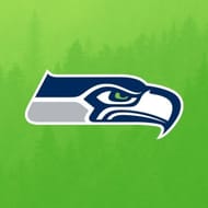
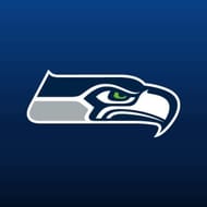
The Seahawks are one of the five teams to have a bird logo in the NFL. The Osprey head logo has seen a couple of alterations in the past five decades but the aesthetics have remained mostly the same. The logo design adopted by the team was made by artist Marvin Oliver.
1976 - 2001 - Old Logo

The first logo made its debut in 1976 and was used for the longest period. The color palette used for this emblem was forest green and royal blue. The Osprey was facing right. The beak had an arc pointing downwards in the original logo. The eye which was circular had forest green in it.
2002 - 2011
The most distinctive change in the second iteration of the Seahawks logo was the shape of the eye. The eyebrow is now in a frowned design which gives the logo an aggressive look. The color palette of the emblem changed to Seahawks blue and navy blue.
2012 - Present - Current Logo
The lower left corner of the logo changed to gray. The Seahawks navy which was used in previous emblems completely disappeared from the logo. The present color palette of the design has wolf gray, college navy, and action green incorporated in it. The green shade of the eyes got lighter than the previous version but overall the design remained similar to the last one.
Seattle Seahawks Alternative Symbols
Seattle has come up with only two alternate emblems in their existence. One was a full-body bird while the other had only a face profile in it.
2002
The first alternate emblem had a full-body bird in flying motion. It was one of the most detailed logos in the history of the franchise. The color palettes used were Seahawks blue, navy blue, white, and gray. The Osprey was in a forward motion with both wings spread at ninety degrees.
2017

The second alternate version had the same color palette as the primary logo. However, this version had an Osprey facing the front. The logo gave a fierce look with both eyebrows given a frowned shape.
Seattle Seahawks Anniversary Emblems
The Seahawks celebrated the first thirty years of their existence by producing one-anniversary emblem every decade.
1985
This was a simple logo with ‘10’ written in big seahawk blue fonts to celebrate the franchise's 10th anniversary. ‘10’ was outlined in gray. The team’s original logo was inside the number.
2000
The 15th-anniversary round logo had a base color of seahawk blue. Exactly in the middle of the circle was a forest green oval shape which had the Seahawks logo in it. There were ‘SEATTLE’ and ‘SEAHAWKS’ wordmarks at the top and bottom of the circle respectively. ‘2’ and ‘5’ were pasted on both sides of the logo. The emblem had a forest green outline.
2005
The last anniversary logo unveiled by the team was on its 30th anniversary. The shield-shaped emblem was divided from the middle by action green and white color. ‘3’ is written on a white background while ‘0’ is pasted on a green background. Below ‘30’ is the team's name and logo. At the top, ‘30th SEASON’ is written on a seahawk blue backdrop which has three navy blue stars in it. Half the emblem is surrounded by a thick gray outline.
Seattle Seahawks Helmet Design

The Seattle Seahawks have only used three different types of helmets since their inaugural season. They are one of the few teams to have only used one logo on their helmet in the team’s entire existence.
1976 - 2001
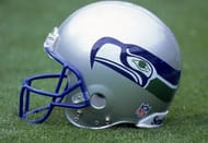
Seattle has always kept it simple when it comes to helmet design. The original helmet had a silver base with the Seahawks logo running on both sides. The base color in later years went on to look more like gray.
2002 - 2011
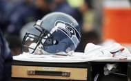
When the team changed the color palette of the original logo, the same happened with their helmet. The base color changed from silver to Seahawks blue. The logo was also updated on both sides of the helmet.
2012 - Present
The current iteration has the base color of darker blue. The color palette changed to the current version of the logo. It is one of the few helmets to have no lines running down the middle.
Alternate Helmets
The team has used only one alternate helmet aside from their primary ones.
2023

This iconic Seahawks helmet with a silver base was brought back once again when the NFL lifted its ban on using two helmets. This helmet is more sleek and modern compared to the original. The logo used on the helmet is also the original version.
Seattle Seahawks Uniform History

The Seahawks have donned many beautiful jerseys over the last five decades.
1976 - 2001
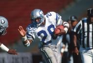
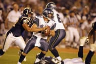
The home jerseys were seahawk blue with blue and green stripes along with white numbering. The pants were silver in color with green/blue/green lines running down on both sides. The away uniforms had white as the primary color with blue numbering and the same stripes as the home version. The pants were also the same as the home ones.
2002 - 2011
2012 - Present
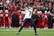
The Seahawks went with a complete rebrand of their color palette. The current color scheme consists of college navy, action green, and wolf gray. The home ones are predominantly college navy with gray numbers outlined by action green. The shoulders have thick gray stripes. The away version has white as a primary color with college navy numbers and shoulder stripe. The pants are blue, the same as the home jersey color with a thick green stripe on it.The pants introduced twelve feathers down each leg which is a tribute to their fans.
Alternate Uniforms

This jersey is a replica of their original one.
FAQ's On Seattle Seahawks Logo History
A. The Seattle Seahawks are owned by Paul Allen.
A. The Seattle Seahawks fans are known as the 12th man.
A. Yes, the Seahawks have changed their logo on their helmets slightly in 2002.
